MAP: Metro Atlanta’s Oldest And Youngest Neighborhoods
Atlanta Regional Commission
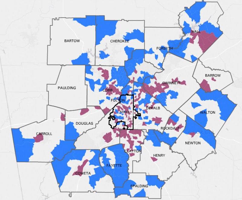
Although Atlanta may be seeing a boom of retirees in recent years, young people still cluster in the city, according to the above map from the Atlanta Regional Commission.
The map uses the color blue to represent the region’s oldest 20 percent of neighborhoods, with around 950 neighborhoods determined by Census tracts and with a median age range determined by the 2010 Census. The color purple represents the youngest 20 percent of metro Atlanta neighborhoods. The median age range used is 16.1 to 52.7.
While areas that skew densely older tend to thrive further outside the perimeter, there are significant pockets of aged neighborhoods in the city, particularly in north and southwest Atlanta. Conversely, the areas with the youngest residents mostly congregate in the core counties inside the perimeter, but a significant chunk of the region’s younger population is nestled in the more rural Hall and Bartow counties.
9(MDAxODM0MDY4MDEyMTY4NDA3MzI3YjkzMw004))


Top Stories