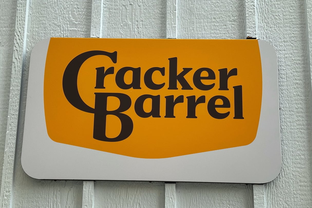
Cracker Barrel is marching forward with an ongoing makeover. And to the dismay of some fans, the chain’s new logo now ditches the barrel itself.
Or rather, the drawing many have associated with Cracker Barrel over the years. The man leaning on that barrel is also gone, as are the words “Old Country Store.” Instead, the new emblem features a simpler design with just “Cracker Barrel” written on a gold background, which also has a semi-updated shape.
“Anchored in Cracker Barrel’s signature gold and brown tones, the updated visuals will appear across menus and marketing collateral,” the Tennessee-based company wrote in a Tuesday announcement. Cracker Barrel added that its logo is “now rooted even more closely to the iconic barrel shape and word mark that started it all.”
Read this story now for free
To continue reading, sign up for our newsletter and get unlimited access to WABE.org
You can select your preferences for news and local content. We will never share your email address. Learn how your newsletter sign-up will support WABE and Public Media