Atlanta is a city of high highs and low lows when it comes to income; it tops the list for income inequality in U.S. cities. A MARTA ride from north to south illustrates the stark divide, with a median household income of $104,518 at Buckhead Station and of $19,447 at West End Station.
For context, the median household income in Atlanta from 2011-2015, according to the U.S. Census Bureau, was $47,527.
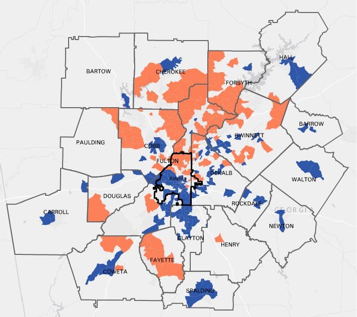
The above map from the Atlanta Regional Commission shows where metro Atlanta’s richest and poorest neighborhoods cluster. The color orange shows the top 20 percent of neighborhoods with the highest median household income, ranging from $81,250 to $178,438. Blue indicates the bottom 20 percent of neighborhoods with the lowest median incomes, from $10,000 to $37,632.
Read this story now for free
To continue reading, sign up for our newsletter and get unlimited access to WABE.org
You can select your preferences for news and local content. We will never share your email address. Learn how your newsletter sign-up will support WABE and Public Media